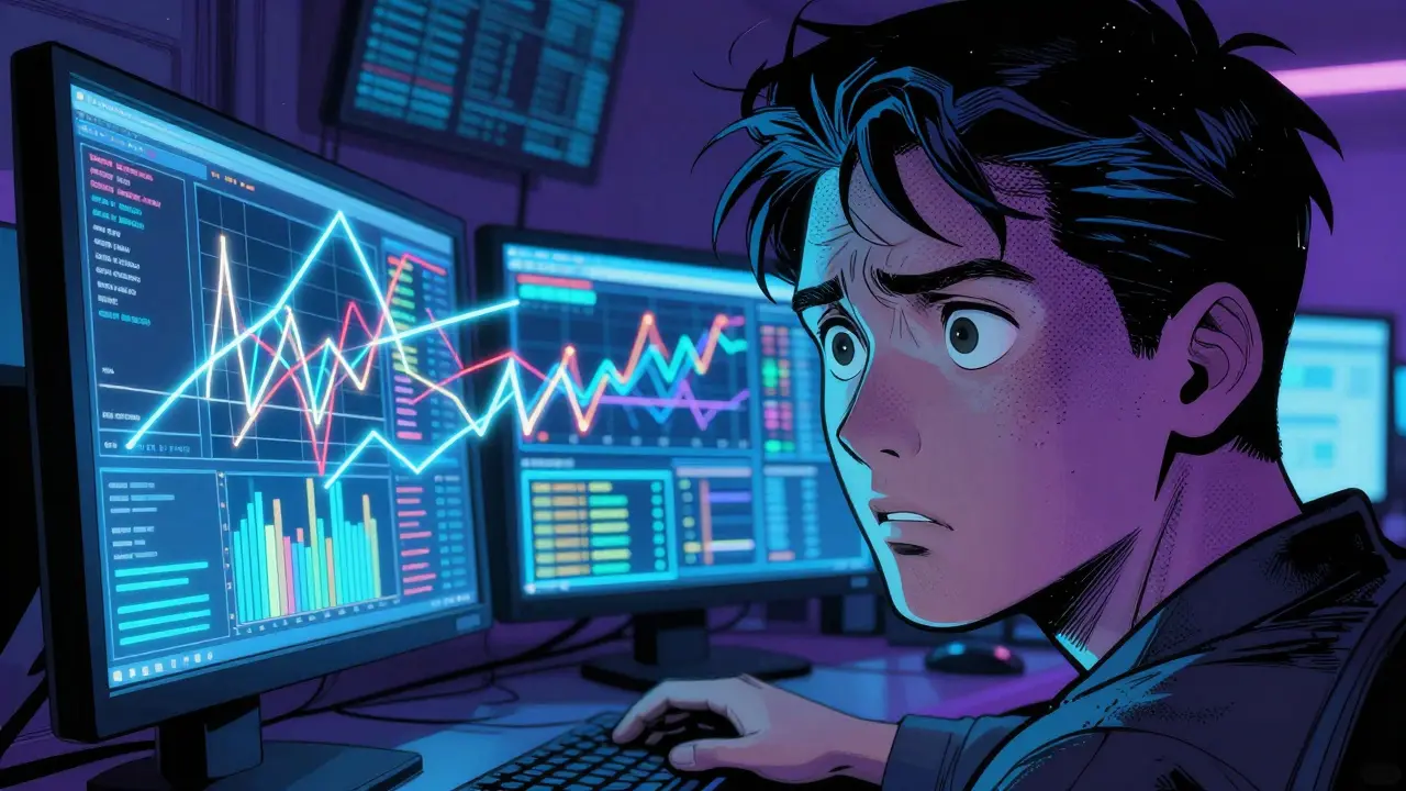
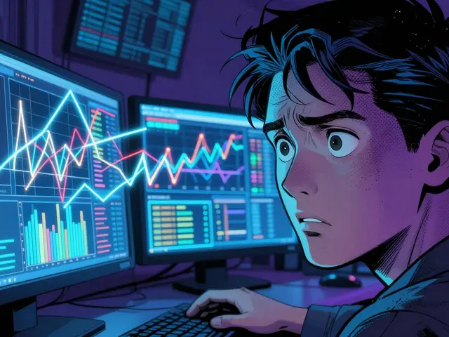
How to Read Spot Price Charts: A Beginner's Guide to Technical Analysis
Whether you're trading Bitcoin or blue-chip stocks, the goal is the same: find a pattern that repeats and bet on the likely outcome. While some argue that markets are totally random, behavioral finance shows that people tend to react to the same triggers over and over again. That's why technical analysis works. It doesn't care about a company's quarterly earnings or a sudden tweet from a CEO; it only cares about what the price is doing right now.
The DNA of a Price Chart: Understanding OHLC
Before you can spot a trend, you need to understand what a single data point actually represents. Almost every professional chart relies on the OHLC framework. Think of this as the "biometrics" of a price movement for a specific timeframe (like one hour or one day).
- Open: The price the asset started at when the period began.
- High: The absolute peak price reached during that window.
- Low: The lowest dip the price hit.
- Close: The final price when the period ended.
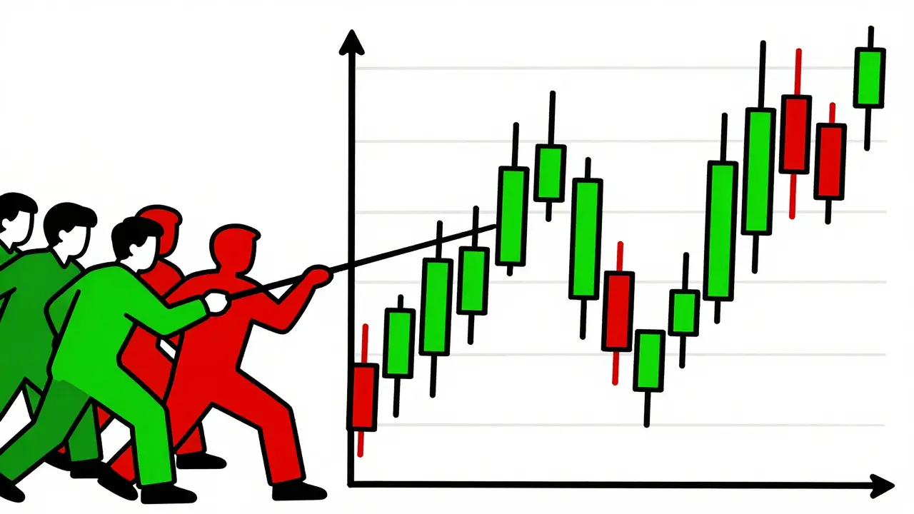
Why does this matter? Because the gap between the open and the close tells you who won the battle for that time period. If the close is much higher than the open, buyers dominated. If it's lower, sellers took control. When you see these points plotted over time, you aren't just looking at numbers; you're looking at a tug-of-war between buyers and sellers.
Choosing Your Lens: Line, Bar, and Candlestick Charts
Not all charts are created equal. Depending on what you're looking for, you'll want to switch your "lens." Most platforms like TradingView or Binance let you toggle between these three main styles.
| Chart Type | What it Shows | Best Use Case | Main Drawback |
|---|---|---|---|
| Line Chart | Closing prices only | Long-term trend spotting | Hides volatility/dips |
| Bar Chart | Full OHLC data | Professional futures trading | Less intuitive visually |
| Candlestick | OHLC with color coding | Crypto & Equity day trading | Can give false signals in low volume |
Line charts are great for a "birds-eye view." If you want to see if an asset has grown over five years, a line chart removes the noise. However, if you're trying to time an entry today, you need Candlestick charts. Originating from 18th-century Japanese rice traders, these use a "body" to show the open-to-close range and "wicks" to show the highs and lows. A big green body means strong buying momentum; a long upper wick means the price tried to climb but got smacked back down by sellers.
Mastering the Art of Pattern Recognition
Once you can read individual candles, you start looking for clusters. Patterns are essentially the "shapes" of market psychology. Some are reliable, while others are just traps.
One of the most famous is the Head and Shoulders pattern. It looks like three peaks, with the middle one being the highest. When the price drops below the "neckline" (the low points between the peaks), it's a strong signal that the trend is reversing from bullish to bearish. In fact, some data suggests these can have a success rate of over 70% when backed by a spike in trading volume.
Then there are "continuation" patterns, like the Cup and Handle. This looks like a tea cup-a rounded bottom followed by a slight dip (the handle). When the price breaks above the handle, it usually signals that the asset is ready for another leg up. But be careful: these patterns only work if the rest of the market isn't in a total panic. For example, during the Silicon Valley Bank crisis, many "perfect" chart patterns failed because systemic fear overrode the technicals.
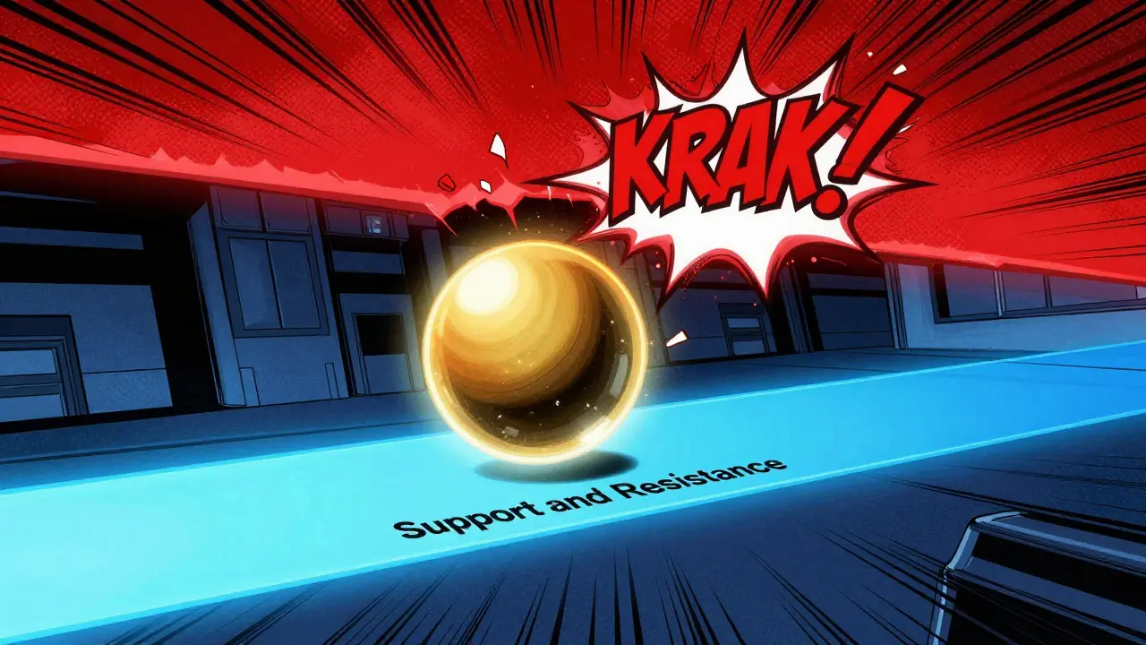
The Invisible Walls: Support and Resistance
If you imagine price as a rubber ball bouncing in a house, Support is the floor and Resistance is the ceiling. Support is a price level where buyers consistently step in to stop the price from falling further. Resistance is where sellers consistently enter to keep the price from rising.
A professional rule of thumb is that a level isn't "real" until it's been tested at least twice. If a price hits $50,000 and bounces back up twice, that's a strong support zone. The magic happens when a ceiling becomes a floor. This is called a "role reversal." Once the price breaks through a resistance level, that old ceiling often becomes the new support level for the next climb.
The Pro Workflow: Multi-Timeframe Analysis
A common mistake beginners make is "zooming in" too far. They look at a 1-minute chart and panic because the price dropped 1%, not realizing that on the daily chart, the asset is still in a massive uptrend. This is why the pros use a top-down approach.
- The Big Picture (Daily/Weekly): Use these to find the general direction. Is the market trending up, down, or sideways?
- The Setup (4-Hour/1-Hour): Look for your patterns here. Is a head-and-shoulders forming? Is the price hitting a major support level?
- The Trigger (15-Minute/5-Minute): Use these short timeframes to time your exact entry. Look for a strong bullish candle to confirm the move before jumping in.
By combining these, you avoid the "noise" of short-term volatility while still getting a precise entry point. It's the difference between knowing the weather for the month and knowing exactly when the rain will start today.
Avoiding the "Bull Traps" and Whipsaws
Technical analysis isn't a crystal ball; it's a game of probabilities. You will encounter "whipsaws"-where the price breaks a pattern, tricks you into buying, and then immediately crashes. To avoid this, never rely on a chart pattern alone. Always look for confirmation.
The best confirmation tool is volume. If the price breaks a resistance level but the trading volume is low, it's likely a fake-out. A real breakout needs a surge of volume, proving that big institutional players are actually behind the move. Think of volume as the fuel; a car can't go far without it, and a price breakout can't sustain itself without a massive amount of trading activity.
Can I use these charts for long-term investing?
Yes, but you should switch to longer timeframes. Use monthly or weekly charts to identify long-term support zones and major trends. Avoid 15-minute or 1-hour charts for long-term goals, as they provide too much irrelevant noise.
Which chart type is best for beginners?
Start with line charts to understand the general trend, then move to candlesticks. Candlesticks are the industry standard because they provide the most visual information about market sentiment at a glance.
Do chart patterns always work?
No. They are probabilistic, not guaranteed. Patterns can fail due to unexpected news events, low liquidity, or "market manipulation." Always use a stop-loss to protect your capital.
What is a "false breakout"?
A false breakout (or bull trap) occurs when the price moves above a resistance level, leading traders to believe a new uptrend has started, only for the price to quickly reverse and fall back below that level.
How long does it take to learn this?
Research suggests it takes roughly 80 to 90 hours of deliberate practice to identify patterns with reasonable accuracy. The key is practicing on historical data (backtesting) before risking real money.


basically just basic ta 101 here. if u actually want to make money u gotta look into order flow and liquidity gaps since patterns alone are mostly lagging indicators and get hunted by hft algos anyway
How quaint. The notion that one can distill the chaotic volatility of global markets into a few simplistic geometric shapes is truly adorable. I suspect the author believes that identifying a "cup and handle" is a substitute for a genuine understanding of macroeconomics. It is a charmingly naive approach to capital preservation.
Bro this is exactly how I started!! 📈 just add some RSI and MACD to your chart and you will see the trend way better!! trust me 🚀🔥
nice breakdown for anyone just getting started. just remember that the higher the timeframe the more reliable the support and resistance levels are. dont get too caught up in the 1m noise or you'll just stress yourself out for no reason
Yawn. This is such basic stuff. 🙄 Why are we acting like this is some secret knowledge? Everyone knows about head and shoulders. Please, give us something that actually requires a brain 💅
Omg I tried a cup and handle last week and I literally lost half my portfolio in ten minutes! Like, the chart said it was a go but the market just decided to ruin my entire life for fun. I'm actually shaking just thinking about it lol!
totally agree with the volume part!! if there's no volume the breakout is just a fake out 💯🙌
Great tips! I sugest adding some moving averages like the 200 EMA for long term trend confirmashun. its a life saver for avoidng bull traps if u check the daily chart first
The west thinks they invent technicals but India has a deep spiritual connect with the rhythms of wealth far beyond these simple liness. This guide is okay but it lacks the laurging cosmic perspective of how true money flow works in the east. Too much focus on a few candles and not enough on the soul of the market
I really appreciate how this breaks things down for people who are intimidated by the software. It can feel so overwhelming at first, but taking it one step at a time like this makes it feel way more approachable.
It is truly commendable to see such an organized introduction to market analysis. I believe that with patience and a disciplined approach to learning these foundations, any individual can improve their financial literacy. Please continue to share such encouraging resources.
I just can't believe people still pay for "courses" that teach this exact stuff. It's practically a moral failing to charge money for information that is literally free on the internet. We really need to stop glorifying these "gurus" who act like they've discovered a magic spell for trading.
Oh wow, a guide that tells us a line goes up and then it might go down. Truly revolutionary stuff here. I'm sure everyone is just rushing to liquidate their savings now that they know what a "wick" is. So helpful!
I've spent years staring at the void of the 1-minute chart and it eventually consumes you. You think you see a pattern, but really you're just seeing your own desperation reflected back at you. These "invisible walls" are just mirrors of our own failure to accept randomness.
this is a very gentle way to explain a complex topic. its important to remember that everyone learns at their own pace and that is okay